Stock charts can feel overwhelming, especially if you're new to investing or trading. In this guide, you'll learn to identify key chart types, patterns and signals to help you make more informed decisions. We'll break down each concept in clear, simple terms.

A stock chart is a visual representation of a stock’s price movements over time. It allows investors to analyze historical data and identify trends, patterns and potential entry or exit points for trades. Think of it as a snapshot of investor sentiment and market behavior, told in numbers and lines.
Note that, while charts can provide valuable insights, they don't guarantee future price movements. Market conditions can change rapidly.
1. Line chart
The most basic chart form. A line chart connects closing prices over a period with a simple line, helping you quickly see a trend. While they don’t show intraday price action or volatility, they offer a clean, uncluttered view of general market direction. This is popular among beginners or those focused on long-term trends.
2. Bar chart
Each bar shows the open, high, low and close for a given period. It’s more detailed than a line chart and helps spot volatility. Bar charts offer more depth by showing whether the price closed higher or lower than it opened, but can be less visually intuitive than candlesticks for some traders.
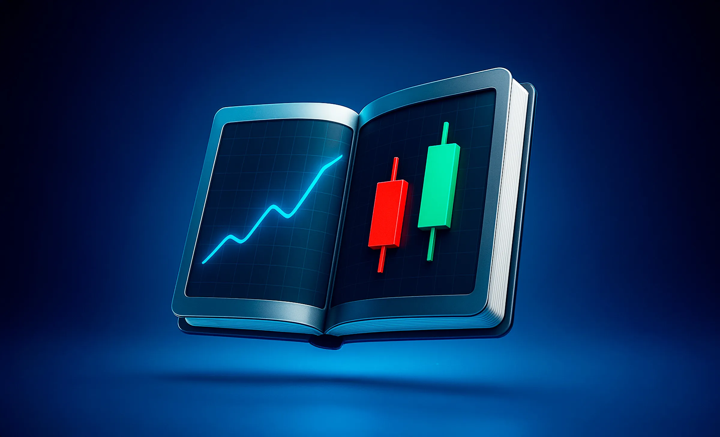
3. Candlestick chart
The most popular among traders. It’s a colorful and intuitive way to see market movement, with each 'candle' showing the open, close, high and low price. Red means the price went down; green means it went up. Candlestick charts help traders quickly assess market sentiment and identify specific formations that can signal reversals or trend continuation.
For example, imagine you’re watching a stock over a week. A line chart would show whether the price went up or down, but a candlestick chart would show you how much it fluctuated during each day.
Price charts paint a picture of a stock’s journey. For example, Apple (AAPL) often shows steady, long-term growth with occasional dips, which could be interpreted as stability. On the other hand, meme stocks such as GameStop (GME) can exhibit sharp spikes followed by rapid declines, making their charts look more erratic.
These visual distinctions can help beginners quickly gauge whether a stock tends to move predictably or unpredictably. Even just seeing how a price moves can clarify whether you're looking at a volatile stock or a more stable performer.
Stock charts come packed with information. Here are the core elements you’ll encounter and how to make sense of them:
1. Axes for time and price
The axes work together to show the change in stock price over a period. You can quickly spot trends, whether short-term spikes or long-term growth patterns.
2. Volume indicators
Below the price chart, you’ll usually see bars that indicate volume or the number of shares traded during a period. High volume often confirms the strength of a price movement.
Pro tip: A price spike on high volume is more meaningful than one on low volume. It shows wide investor participation and market conviction.
3. Moving Averages (MAs)
A moving average smooths out price data to help identify trends. Common types:
Example: A 50-day SMA shows the average price over the last 50 days. If the current price is above this line, it may signal an upward trend. Traders often use combinations like the 50-day and 200-day SMA to assess longer-term direction.
Understanding these elements creates a solid foundation for reading any type of stock chart. It helps you go beyond the numbers and start seeing meaningful insights.
Candlestick charts tell you four key things in a single graphic:
The body of the candle (colored section) shows the open and close. Wicks (thin lines) show the highs and lows. Green candles indicate the close was higher than the open (upward movement), while red candles mean the close was lower (downward movement).
There are several different types of candlestick patterns, either representing bullish, bearish or neutral price action.
Bullish reversal patterns include:
Bullish continuation patterns include:
Bearish reversal patterns include:
Bearish continuation patterns include:
Pro tip: Always use candlestick patterns alongside other indicators to confirm a trend before making a decision. No single pattern is foolproof. Pay attention to the context – reversal patterns are more reliable when they appear after significant trends, while continuation patterns work best during established trends.
Once you understand chart basics, the next step is recognizing patterns, i.e., recurring shapes that suggest future price behavior.
Support is the price level where a stock typically stops falling and rebounds due to increased buying interest. Resistance, on the other hand, is where a stock usually stops rising and begins to fall due to selling pressure. These levels act like invisible barriers on a chart and understanding them helps traders time entries and exits more effectively.
Support and resistance aren't always exact points, they’re more like flexible zones. A stock might bounce just above or below a support area several times before making a clear move. This is why many traders refer to them as 'zones' rather than fixed lines.
There are different ways to identify support and resistance:
Pro tip: The more times a stock touches a support or resistance zone without breaking it, the stronger that level becomes. A break with high volume often signals a strong move in that direction.
2. Popular chart patterns
Head and shoulders
This pattern looks like – you guessed it – a head between two shoulders. It typically appears after an uptrend and signals a potential reversal to the downside. The 'neckline' is a key level. Once price breaks below it, a further drop is often expected.
Inverse head and shoulders
The mirror image of the above. It appears after a downtrend and signals a potential shift to the upside. Traders often look for a breakout above the neckline with volume confirmation to enter long positions.
Double tops and double bottoms
A double top occurs when price hits a similar high twice, failing to break through and often signals bearish reversal. A double bottom is the bullish counterpart; the price tests a support level twice and bounces, suggesting a move higher.
Triangles (ascending, descending, symmetrical)
Triangles form when price action consolidates, making higher lows, lower highs or both.
Pro tip: Chart patterns work best when combined with indicators and volume. A breakout backed by strong volume carries much more conviction than one on low activity.
Indicators are mathematical tools that interpret price and volume data. Think of them as extra layers that add clarity to your chart analysis. On trading platforms, you can add these indicators directly to your charts. For beginners, indicators help simplify market movements by generating signals based on historical data – for example, highlighting trends, momentum or potential reversals.
1. Relative Strength Index (RSI)
RSI measures how overbought or oversold a stock is, on a scale of 0 to 100.
Example: If a stock has been climbing fast and RSI hits 75, it might be due for a short-term dip.
2. MACD (Moving Average Convergence Divergence)
MACD shows the relationship between two EMAs (usually 12-day and 26-day) and signals momentum shifts.
It's popular because it can highlight changes in trend direction before they become obvious.
3. Bollinger Bands
These are three lines; one in the middle (SMA) and two others above and below it. They measure volatility.
4. Moving Averages (MAs)
As discussed earlier, simple and exponential moving averages are key for spotting trends. Use them to gauge momentum and potential reversal points.
Pro tip: Use RSI to check momentum, MACD for trend direction and Bollinger Bands to assess volatility. Together, they paint a fuller picture.
Reading stock charts like a seasoned trader involves combining what you’ve learned, i.e., patterns, indicators, volume and context.
1. Combine multiple indicators
Don’t rely on just one. For instance, a bullish candlestick pattern backed by rising volume and a low RSI is a stronger signal than any alone.
2. Watch out for these common mistakes
Enjoy next-level stock rewards
Get started with beginner-friendly charting features, real-time data and simple interfaces designed to make trading accessible.
Monitor your favorite stocks with real-time updates, interactive charts and customizable alerts – all in one place.
Boost your trading confidence through in-app tutorials, articles, videos and hands-on modules tailored for new investors.
Download the Crypto.com App for seamless trading or learn how to get stock rewards.
Are chart patterns reliable?
They can suggest what might happen, but they’re not guarantees. Use them alongside indicators like RSI and MACD and always consider the bigger economic picture.
Do stock charts include dividends?
Most price charts don’t include dividend payouts. If you want to see total return (price plus dividends), you’ll need an adjusted chart – something that Crypto.com offers.
Do stock charts repeat themselves?
Patterns can recur because of human psychology. Fear and greed drive similar behaviors. But outcomes vary, so treat charts as helpful tools, not crystal balls.
Why are some stock charts logarithmic?
Logarithmic charts show percentage change instead of raw price, which is useful for visualizing long-term moves in high-growth stocks. A $10 to $100 move looks dramatic on a linear scale, but log scale shows the growth rate more accurately.
Exchange Commission (SEC) and a Member of the Financial Industry Regulatory Authority (FINRA) and the Securities Investor Protection Corporation (SIPC). For further information about FCUL, please visit FINRA BrokerCheck.
FCUL is a subsidiary of Crypto.com. FCUL is a separate entity from Crypto.com, Foris DAX, Inc. and other affiliated Foris companies. FCUL does not engage in the sale, transfer or custody of crypto currencies or digital assets. Crypto.com is a separate entity from FCUL and does not engage in the securities business. Customer balances and crypto holdings held and transacted at Crypto.com and other entities outside of FCUL are not covered by SIPC insurance and are separate from securities transactions and holdings at FCUL.
All investments involve risk and not all risks are suitable for every investor. The value of securities may fluctuate and as a result, clients may lose more than their original investment. The past performance of a security or financial product does not guarantee future results or returns. Keep in mind that while diversification may help spread risk, it does not assure a profit or protect against loss in a down market. There is always the potential of losing money when you invest in securities or other financial products. Investors should consider their investment objectives and risks carefully before investing.
This is informational content sponsored by Crypto.com and should not be considered as investment advice.