Have you ever looked at a token chart and wondered whether to buy or sell crypto? Learn how to read crypto charts for informed decisions in this article.

-in-crypto-2.webp)
Have you ever looked at a token chart and wondered whether to buy or sell crypto? Learn how to read crypto charts for informed decisions in this article.
Reading a crypto token chart is one of the most important skills to have when trading crypto. The ability to assess price movements and recognise patterns in the charts is crucial to doing what in finance is called technical analysis.
Don’t be intimidated by this term. Technical analysis uses market-driven information, such as trading volumes, chart patterns, and other market-based technical indicators, to inform a trader on the best available options for trading an asset.
In this article, we kick off things with the basic skills for anyone to learn:
More advanced readers can also read our in-depth piece on option trading strategies.
Cryptocurrency exchanges typically show an always-updating price chart for any particular trading pair. Most often, the trading pair consists of the user’s desired cryptocurrency paired with USD. But users can also pair with other currencies or cryptos.
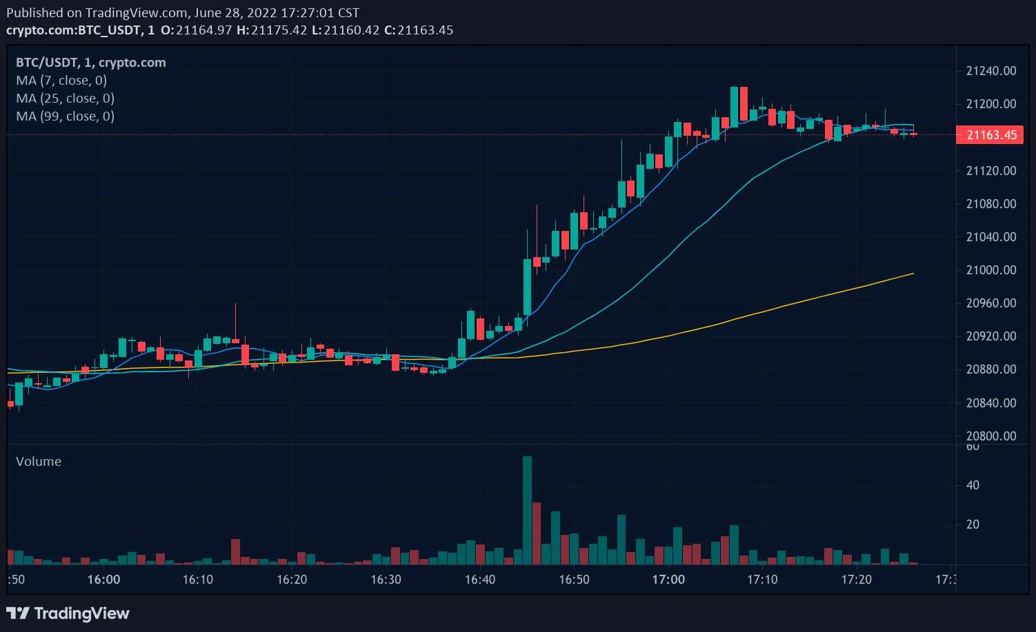
The information provided in the chart above shows the key data points that serve as the basis for the numerous indicators a market participant can use for trading cryptocurrencies. For example, the chart, taken from the Crypto.com Exchange, shows the BTC/USDT trading pair (Bitcoin/Tether, a US dollar-pegged stablecoin), with seven key data points:
But perhaps the most important part of this chart is the group of candlesticks that make up the price chart.
A candlestick is the main price indicator in most crypto price charts. Each candlestick represents price activity within one unit in time (e.g., 30 minutes), as shown in the chart above.
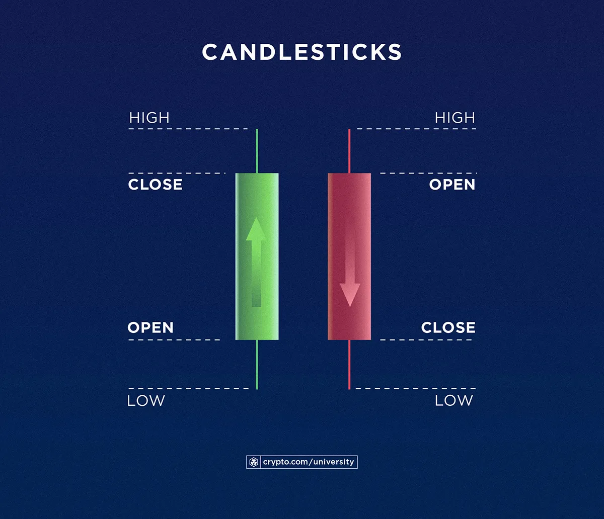
A candlestick consists of two main bars: the body (the thicker part), which indicates the opening and closing prices of an asset; and the wick (the thinner part), which shows the highest and lowest price points.
On most crypto charts, a green candle indicates a bullish move or a price increase, while a red candle shows a bearish move or a price decrease.
Below is a macro view of the candlesticks — note the opposite flow of the price increase vs decrease bars:
Based on the price and volume data that the market generates day by day, technical analysts have developed several chart-based indicators to aid them in assessing the potential next price move of the assets they trade.
Some of these indicators are basic pattern assessments of a combination of candles, while others are more sophisticated trendlines and metrics based on recent price movements.
Let’s discuss some of the more basic patterns first.
Candlestick patterns are generally categorised into bullish and bearish patterns. A bullish pattern generally indicates future positive price movement for an asset, which may incite a trader to buy in anticipation that the token will increase in value. The inverse happens with a bearish pattern, which may incite some traders to sell before the potential downwards price movement.
Of course, other traders may ‘buy the dip’, deciding to make anti-cyclical moves by buying more when prices drop if they expect a later increase. Trading is, after all, a personal decision.
See our in-depth guide on how to read candlesticks.
Below are examples showing candlesticks and chart patterns used by traders to anticipate price movements.
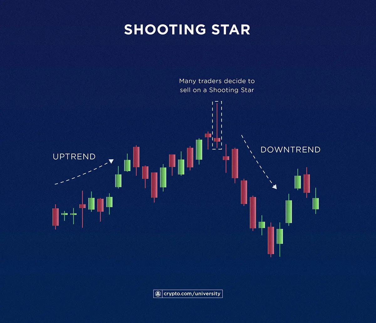
The shooting star candlestick is a bearish pattern usually appearing at the end of a price uptrend. This candlestick has a short body situated near the bottom and a long wick that extends upwards. It indicates that an asset’s price slightly decreased by the end of the trading period, even after reaching higher prices along the way, which explains its red colour.
Analysts interpret this as a sign that there is resistance against the further increase in price, and a sell-down is imminent. In other words, many traders decide to sell in anticipation that prices may drop.
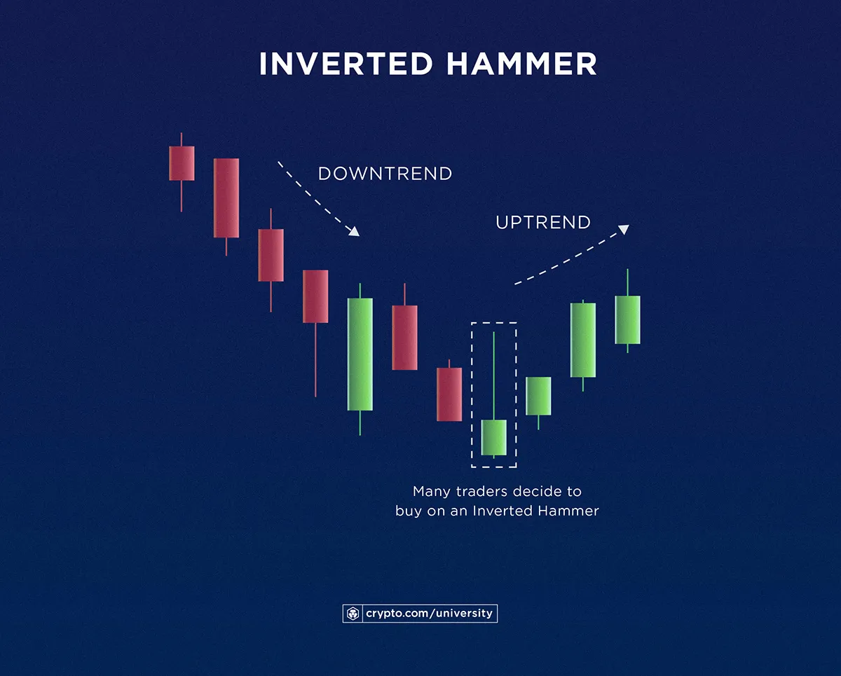
The inverted hammer candlestick looks like a shooting star candlestick, but it is bullish instead of bearish, as shown by its green colour. Here, the candlestick shows that the price slightly increased by the end of the trading period after reaching higher prices along the way.
Seeing this candlestick following a price downtrend is a good sign, according to some analysts, indicating that the price may be about to rebound because it generally indicates there is high buying demand at that particular moment.
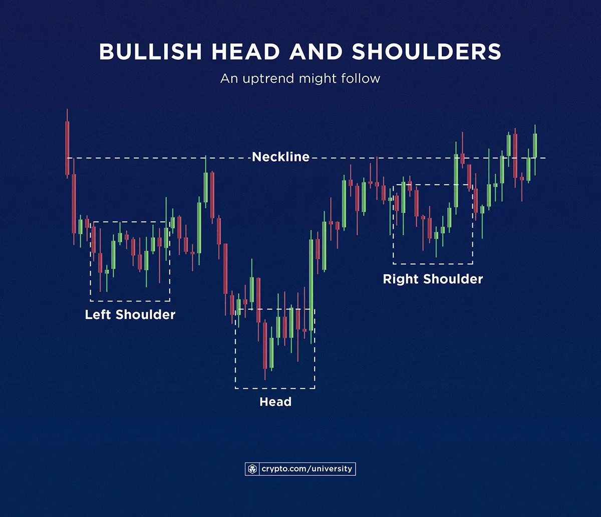
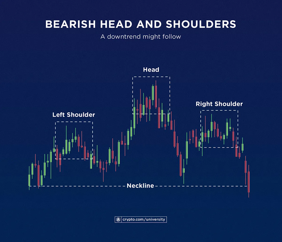
By zooming out of individual candlesticks to see the general crypto charts, users can unearth even more patterns. One such arrangement is called ‘head and shoulders’, which is characterised by three peaks or valleys that show up next to each other. In this pattern, the second peak or valley looks like a ‘head’ that overshadows its neighbours on both sides (the ‘shoulders’), giving this pattern its moniker.
A bullish head and shoulders pattern, coloured in green on the left side of the chart, may indicate that the crypto price is about to go on an upswing.
Meanwhile, a bearish head and shoulders pattern, like the one shaded in red on the right, may precede a price downtrend.
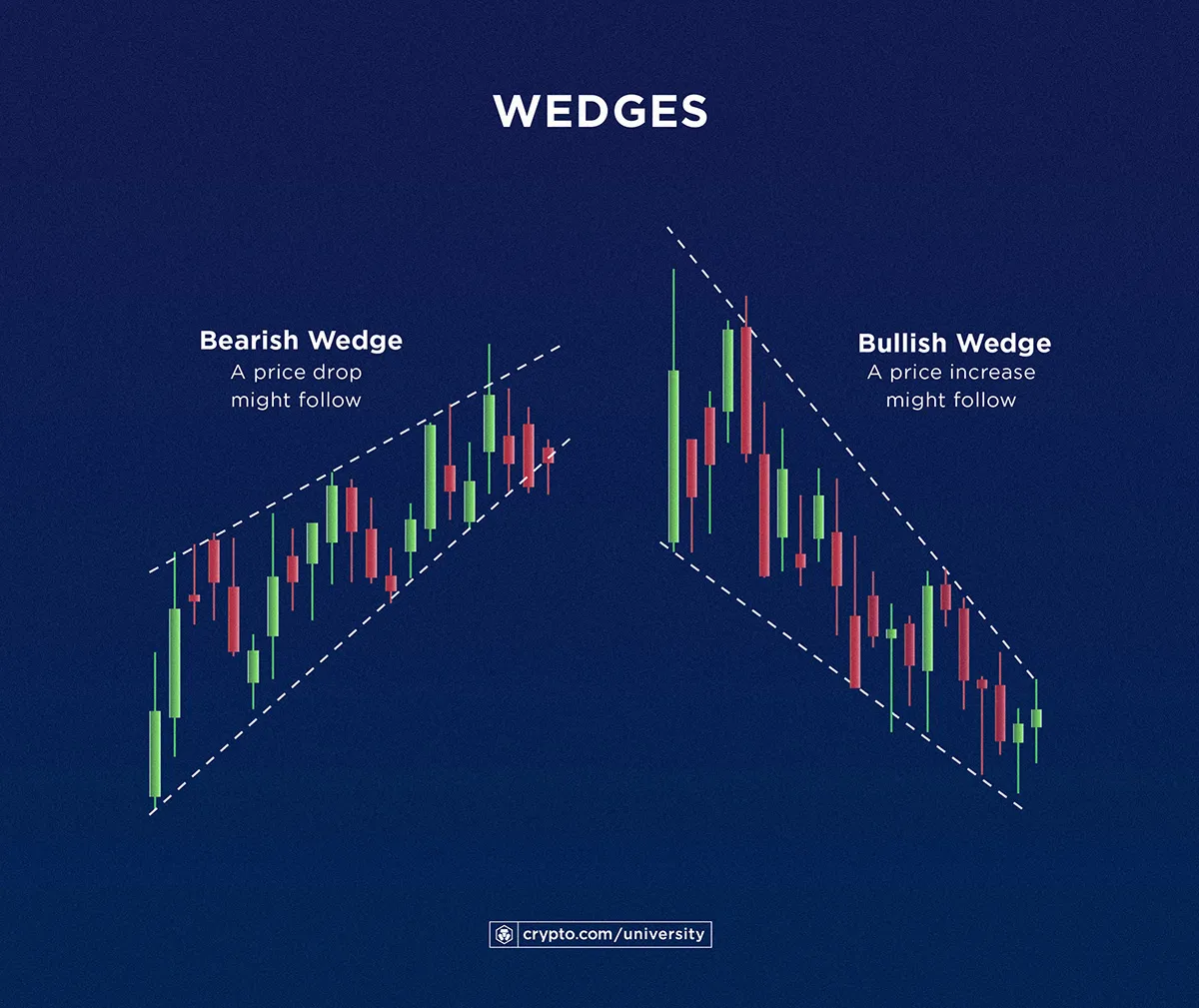
Similar to ‘head and shoulders’, users can also see ‘wedges’ as patterns in crypto charts that involve a wider point of view. Wedges can be traced in a crypto chart by drawing a line that connects the lower points of price movement over a period of time to another line for the price peaks. When those two lines approach each other from left to right, it is called a wedge.
A bullish wedge, as shown on the right, is characterised by two lines with downward slopes that almost form a triangle pointed downwards. This pattern may indicate that, as the up-and-down movement of the price is stabilising near the bottom, the asset may soon swing in a more positive direction.
Meanwhile, a bearish wedge shows two lines with upward slopes and near-convergence at a high point. This may precede a peak in the crypto price and a subsequent sell-off.
As with many things in crypto, it is important for market participants to do their own research on several topics, including trading indicators and strategies. This article is by no means hard-and-fast advice, but only an informational guide to trading basics. There is no singular indicator, technique, or method that can predict the market’s direction. This is especially true for candlestick and crypto chart patterns.
As a basic part of technical analysis, reading charts should serve as an introduction to understanding the crypto market better through learning more techniques and crypto market factors. Reading candlesticks and charts should not be a participant’s sole basis for forecasting the market.
Stay up to date on the market with Crypto.com Price. Seamlessly switch between TradingView charts and Crypto.com’s proprietary charts, while also accessing historical data, top NFT collections, and more.
Important information:This is informational content sponsored by Crypto.com and should not be considered as investment advice. Trading cryptocurrencies carries risks, such as price volatility and market risks. Before deciding to trade cryptocurrencies, consider your risk appetite. Services, features and other benefits referenced in this article may be subject to eligibility requirements, token holdings, and may change at the discretion of Crypto.com.
Past performance may not indicate future results. There's no assurance of future profitability, and content may not reflect current opinions.